Spinola Personal Branding
Personal Projects
SYNOPSIS
Spinola is me, everything that has to do with my professional design and illustration work will have this branding stamped on it on some shape or form staying approachabile and while keeping things consistant. The most important function of my personal branding is to easily communicate to the audience that this is me, while leaving room for expression.

Brand tone - 01
Thoughtfully concise
Brand tone - 02
Playfully weird
Brand tone - 03
Comforting to a naked eye
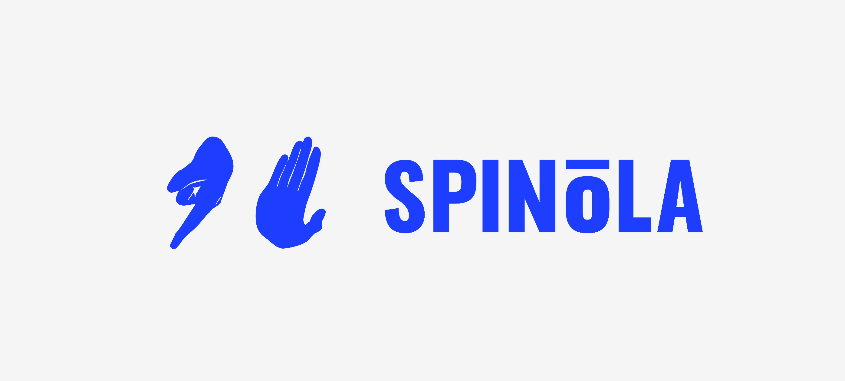
LOGO / BRANDMARK
BUT WHAT DOES IT MEAN
A Brand’s Logo and Brandmark is it’s most important aspect, the visual identifier that the audience will always asociate when trying to remember the brand. The Hands brandmark is a visual interpretation of my surname, split into two parts. One hand represents “Spin”, while the other represents “Ola” a.k.a. "hello". Together they form a simple, flat vector mark designed to be clear, approachable, and easily recognisable across digital and print applications.


COLOURS
COLOURS OF THE BRAND
The main set of colour used is a vibrant funky blue that works wonders against any light grey or full white background. Always used with blue font and a white or grey background.
#F4F4F4
LIGHT GREY
#1D3EFF
FUNKY BLUE
#FFFFF
WHITE WHITE WHITE
#434343
KINDA DARK BLACK
TYPOGRAPHY
BE A FONT WIZARD
I use two different font types Oswald, a beautiful bold typeface for headings and Neue Haas Unica W1G a font predecessor of the famous beautiful Helvetica font family. I used these two simply because of the balance they provide each other for a clean bold and proud look that they provide.
OSWALD IS THE FONT USED FOR HEADINGS, BIG AND SMALL
AaBbCcDd
Neue Haas Unica W1G is used for any and all paragraph text that I use with my brand, and should never be used for any headings, I mean just look how nicely it balances out the heavy-block like font above.
 B.H.M.B.F
Devops Internship Flyer
B.H.M.B.F
Devops Internship Flyer
